Configuring the Signature Canvas
Introduction
The signature canvas is the place where the user is able to sign a document. It appears when the handwritten option is selected on the signing options.
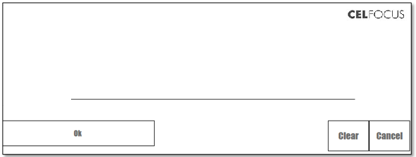
It is possible to configure the Signature canvas interface through a JSON configuration file stored in the esign-home folder. The default JSON file is the file located at esign-home/resources/plugin/templates/default.json.
The configuration file allows for the introduction of UI components into the Signature canvas such as:
-
Buttons
-
Lines (horizontal and vertical)
-
Images
-
Rectangles
-
Text Boxes
Adding a new template
If the need occurs to have multiple different canvas configurations for different documents, this can be achieved by creating another JSON configuration file in the templates folder. (see: Template Folder)
Using a template
When creating a contract in eSign, it is possible to specify which template to use for all the signature fields of the document, or for a specific signature field.
| If no template is specified, the default.json file will be used to configure the canvas. |
On a specific document
To use a specific template on a document, the document creation request must include an artifact variable with variable name PLUGIN_TEMPLATE, and variable value equals to the name of the template json file.
{
  "artifact": <BASE64>,

  ...

  "variables": [{
    "name": "PLUGIN_TEMPLATE",
    "value": "myTemplate"
  }]
}
On a specific signature field
To use a specific template on a single signature field, the document creation request must include a signature field variable with variable name PLUGIN_TEMPLATE, and variable value equals to the name of the template json file.
{
  "artifact": <BASE64>,
  "signatureFields" : [
    {
      "name" : "SignatureABC",

      ...

      "variables": [{
        "name": "PLUGIN_TEMPLATE",
        "value": "myTemplate"
      }]
    }
  ]
}
On a specific brand
It is also possible to override the default template with a new one if you apply branding to your documents and have a template for that branding.
For instance, if the configured brand is premium, by default (and if no template was specifically defined for the document or the signature field) eSign will look for a template named premium.json. If none is found, it falls back to the default template.
On a transcription field
Transcription fields, like the signature fields, may have their own templates.
When opening a transcription field eSign will check for the template for that brand, document or field, and try to load a template name <your_template>Transcription.json.
If no transcription template exists, eSign will fallback to the signature template logic described in the sections above.
Configuring UI Components
The plugin’s UI components can be customized in a lot of ways. The user can customize its position, size, font, text, among others. The following table enumerates the configurable fields of each component:
| Do not use inline comments or comment blocks in your json configuration. It may break the expected functionality. |
| Component Field | Value Type | Description |
|---|---|---|
code |
Integer |
A number that represents the action the component triggers then clicked |
x |
Positive Integer |
The top right x value of the component |
y |
Positive Integer |
The top right y value of the component |
width |
Positive Integer |
The width of the component |
height |
Positive Integer |
The height of the component |
repeat |
Integer |
The number of times to repeat the component |
repeatX |
Positive Integer |
Each repetition of the component will move that value to the right |
repeatY |
Positive Integer |
Each repetition of the component will move that value to the bottom |
text |
String |
The text to be displayed, wrapped and centered in the component |
fontSize |
Positive Integer |
The text’s font size |
font |
String - Font family name (must be installed on the current system) |
The font family used to render the text |
borders |
Boolean |
A boolean value that determines if the component’s borders are drawn or not |
base64 |
String - Base64 |
A string representative of a Base64 image. The base64 encoded string must terminate in "==", otherwise it will not work. Most encoders already place these characters at the end, but double check it |
| The * character after a number will imply that it is a relative number. This means that, for example, in a 500 by 500 canvas, an x and y of "0.1*" and "0.2*" respectively will be translated to x=50 and y=100. |
The next table shows which fields are settable for each UI Component type.
| Field\Component | Button | Vertical Line | Horizontal Line | Text Box | Rectangle | Image |
|---|---|---|---|---|---|---|
Code |
✓ |
|||||
x |
✓ |
✓ |
✓ |
✓ |
✓ |
✓ |
y |
✓ |
✓ |
✓ |
✓ |
✓ |
✓ |
width |
✓ |
✓ |
✓ |
✓ |
✓ |
|
height |
✓ |
✓ |
✓ |
✓ |
✓ |
|
repeat |
✓ |
✓ |
✓ |
✓ |
✓ |
✓ |
repeatX |
✓ |
✓ |
✓ |
✓ |
✓ |
✓ |
repeatY |
✓ |
✓ |
✓ |
✓ |
✓ |
✓ |
text |
✓ |
✓ |
||||
fontSize |
✓ |
✓ |
||||
font |
✓ |
✓ |
||||
borders |
✓ |
✓ |
||||
base64 |
✓ |
The following one shows the codes that can be assigned to each button or image.
| Code | Number | Description |
|---|---|---|
SIGN_OK |
201 |
The OK button was pressed, this means the user ordered the signature to be inputted |
SIGN_CLEAR |
202 |
The CLEAR button was pressed; this means the user wants to delete the current input WITHOUT canceling the sign process. The canvas is cleared and everything proceeds as normal |
SIGN_CANCEL |
203 |
The CANCEL button was pressed, this means the user wants to delete the current input AND cancel the sign process. The canvas is cleared and the plugin closes |
ROTATE |
301 |
The ROTATE button was pressed therefore the WACOM tablet’s interface will be rotated by 180º. The canvas is cleared and everything proceeds as normal |
| Only the provided codes should be used on the plugin, any other codes can lead to unwanted results. |
Examples
Button
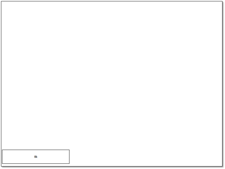
An example of a submit button configuration would be:
"buttons" : [{
    "x": "10.0", // x coordinate is 10.
    "y": "0.9*", // y coordinate is (0.9*canvas height) (notice the )
    "height": "50", // height is of 50 pixels
    "width": "0.3", // width is of (0.3*canvas width)
    "fontSize": "10", // the text has a font size of 10
    "text": "Ok", // the text of the button is "Ok"
    "font": "Impact", // it renders the text with the Impact font
    "code": 201, // the action code is 201 (Submit action)
    "borders": true // The borders of the button will be drawn
}]
This results in the following canvas:
Repeating components
Repeating components can be a chore when done manually, so, bellow is an example of the simplified repeating process this plugin provides. Every UI Component can make use of this process.
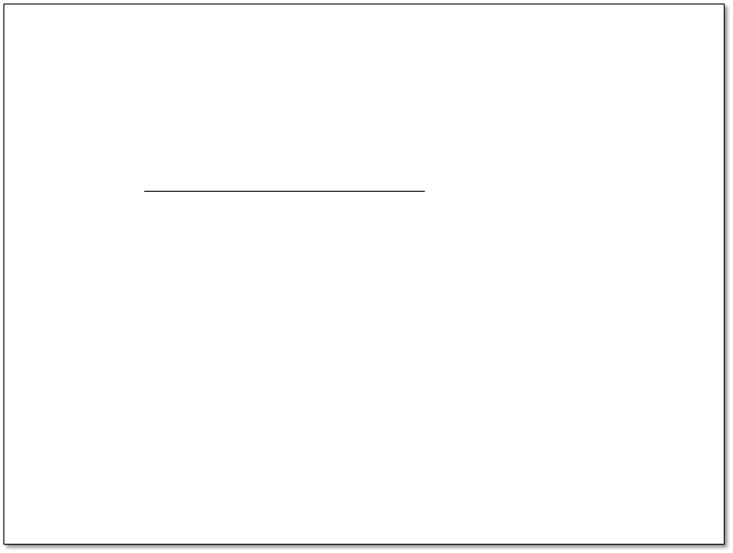
Let’s now say we want to repeat a Line; first we have:
"horizontalLines": [{
        "x": "0.2*",
        "y": "0.3*",
        "width": "300"
}]
Which generates:
Repeating the line object several times would be very tedious and prone to errors. Therefore, by using the "repeat = X" field, we can easily repeat a component X times.
| With repeat = -1 or simply by not defining it, the component will be repeated indefinitely until reaching the maximum size of the canvas. |
"horizontalLines": [{
        "x": "0.2*",
        "y": "0.3*",
        "repeat": "-1", // repeats until reaching max screen size
        "repeaty": "50", // it will move 50 pixels down whenever it repeats
        "width": "300"
}]
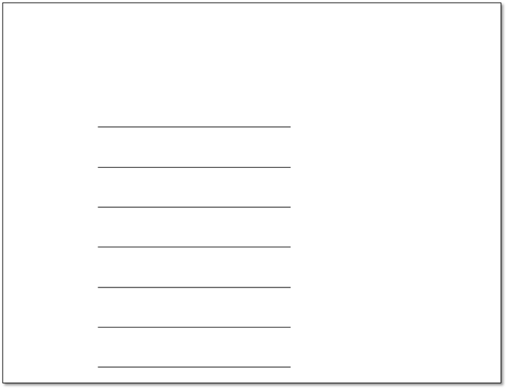
And there it is, easy repetition of components:
Image
Inserting images is as simple as:
"images":[{
        "x": "0.2*",
        "y": "0.2*",
        "width": "0.4*",
        "height": "0.4*",
        "base64": "Image base64 string(...)"
}]| Images will always fill and stretch to fit the given size. Only PNG, JPG, BMP and TIFF formats are supported. Other format usage might provide unexpected results. |

Variables example
It’s possible to use values from artifact or signature field variables to further customize the canvas. The expression ${ARTIFACTVARIABLE:VAR} allows you to access the value of the variable with the name VAR. There are multiple types of variables that are usable while configuring the signing canvas. This is further shown in the Full example section.
In this example there is both a field variable named "SIGNER" and a artifact variable named "NIF".
  "textBoxes": [{
        "x": "0.0*",
        "y": "0.0*",
        "height": "40",
        "width": "0.8*",
        "text": "${FIELDVARIABLE:SIGNER}",
        "fontSize": "0.5*",
        "font": "Impact",
        "borders": true
},{
        "x": "0.0*",
        "y": "40",
        "height": "40",
        "width": "0.8*",
        "text": "${ARTIFACTVARIABLE:NIF}",
        "fontSize": "0.5*",
        "font": "Impact",
        "borders": true
}]
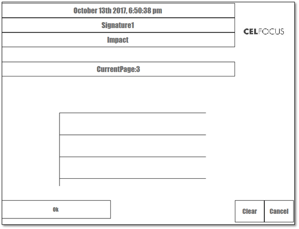
Full example
This example shows a case of a complete use of the signature canvas with it’s multiple configuration points.
{
    "textBoxes": [{
        "x": "0.0*",
        "y": "0.0*",
        "height": "40",
        "width": "0.8*",
        "text": "${DATE:MMMM Do YYYY, h:mm:ss a}", // writes current date
        "fontSize": "0.5*",
        "font": "Impact",
        "borders": true
    },{
        "x": "0.0*",
        "y": "40",
        "height": "40",
        "width": "0.8*",
        "text": "${CURRENTFIELD}", // writes current field name
        "fontSize": "0.5*",
        "font": "Impact",
        "borders": true
    },{
        "x": "0.0*",
        "y": "80",
        "height": "40",
        "width": "0.8*",
        "text": "${COMPONENTDETAILS:font}", // writes "Impact"
        "fontSize": "0.5*",
        "font": "Impact",
        "borders": true
    },{
        "x": "0.0*",
        "y": "160",
        "height": "40",
        "width": "0.8*",
        "text": "${ARTIFACTVARIABLE:NIF}CurrentPage:${CURRENTPAGE}", // first fails
        "fontSize": "0.5*",
        "font": "Impact",
        "borders": true
    }],
    "buttons": [{
        "x": "0.0*",
        "y": "0.9*",
        "height": "50",
        "width": "300",
        "fontSize": "0.3*",
        "text": "Ok",
        "font": "Impact",
        "code": 201
    },
    {
        "x": "0.8*",
        "y": "0.9*",
        "width": "0.1*",
        "height": "0.1*",
        "fontSize": "0.3*",
        "text": "Clear",
        "font": "Impact",
        "code": 202
    },
    {
        "x": "0.9*",
        "y": "0.9*",
        "width": "0.1*",
        "height": "0.1*",
        "fontSize": "0.3*",
        "text": "Cancel",
        "font": "Impact",
        "code": 203
    }],
    "verticalLines": [{
        "x": "0.2*",
        "y": "0.5*",
        "height": "200"
    }],
    "horizontalLines": [{
        "x": "0.2*",
        "y": "0.5*",
        "repeat":3,
        "repeaty": "0.1*",
        "width": "0.5*"
    }],
    "images":[{
        "x": "0.2*",
        "y": "0.2*",
        "width": "0.4*",
        "height": "0.4*",
        "base64": "Image base64 string(...)"
    }]
}